3 Simple Pin Design Tips to Stand Out on Pinterest

We all Do it…
Judge a “Book” by it’s Cover.
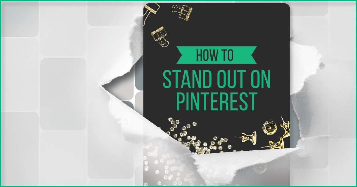
This is why in a visual search engine such as Pinterest designing a Pin that stands out is vital.
When something online catches your eye your brain starts forming an opinion and you decide to look deeper or keep moving.
Or even worse it doesn’t catch your eye at all!
While there are several factors to being visible on Pinterest such as SEO (which you can learn about in Monica’s Pin Practical Masterclass, your Pin Design is important.
Below are my best pin design tips that will make your pins stand out in the Pinterest Feed.
3 Pin Design Tips to Help You Stand Out:

Create a Big Bold Headline:
Make sure your font is easy to read. Use decorative font, such as handwritten fonts, very sparingly and only on very familiar words with your audience.
Remember: that the pin is smaller when first viewed the Pinterest Feed.
Make it Pop with Color:
Use your brightest, boldest brand color as an accent with a word or color block. You can also use color for the background.

Go Big or Go home:
Just kidding don’t go home, but do go tall.
Canva’s commonly used Pin Template is sized to 735px by 1102px. Your pin width needs to stay the same but you can stand out by making your pin much taller. I sometimes use my “double pin technique.”


