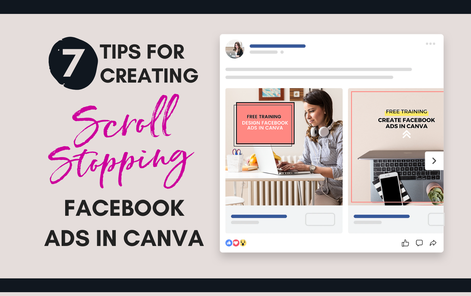
Create Scroll Stopping Facebook Ads
The graphic you create for a Facebook ad is important. It is what will stop someone from scrolling on social media and draw them in to read your ad copy.
But how do you design something that stands out in a crowded news feed?
I have 7 Design tips to help you out.
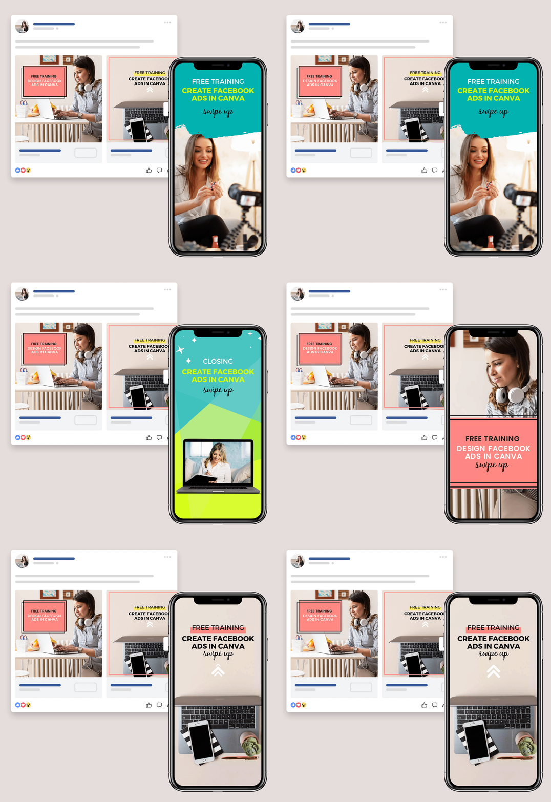
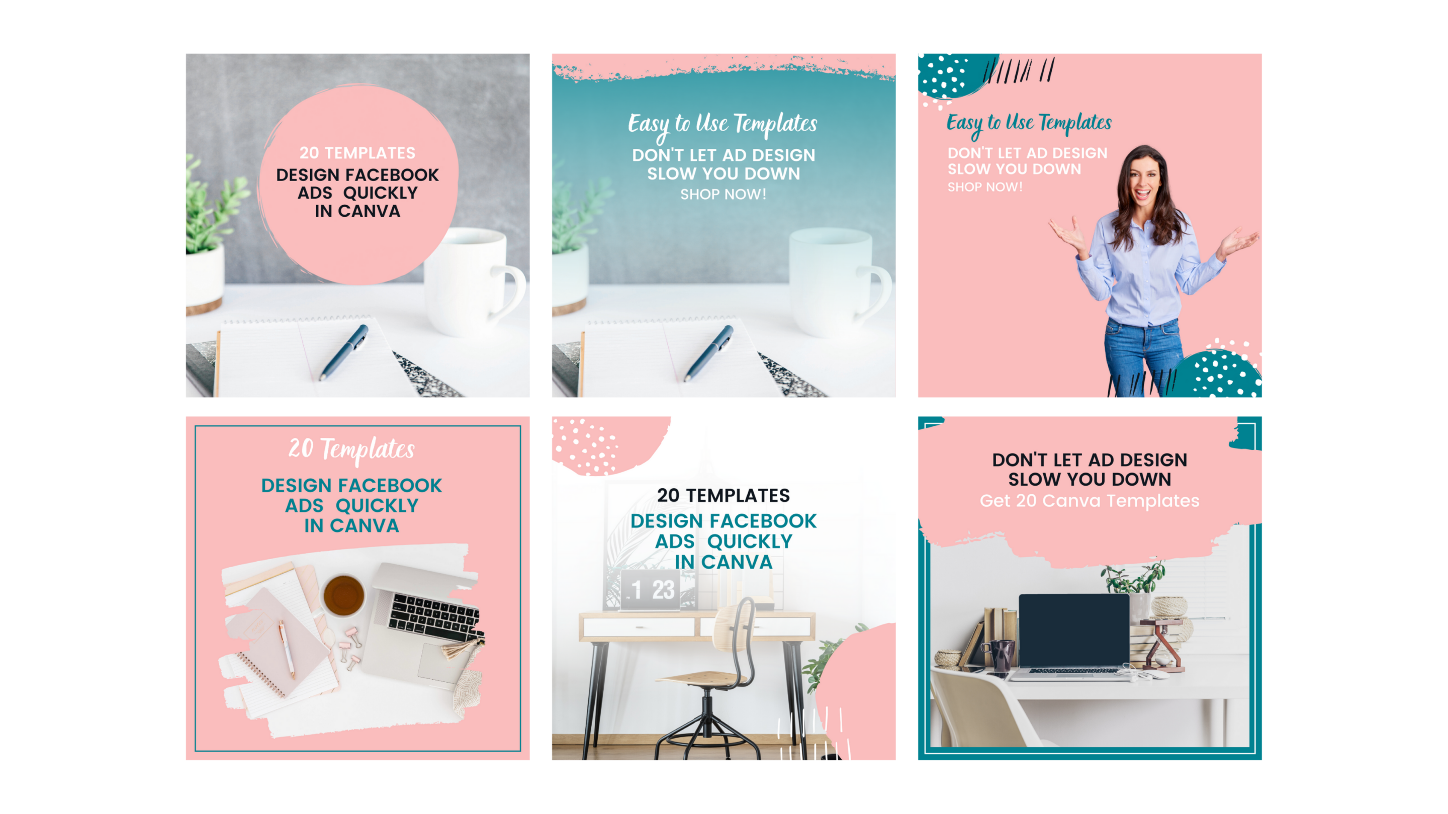
Before we get into the tips be sure to start with the correct size: The goto size is 1080 x 1080 for Facebook and Instagram ads and 1080 x 1920 for story ads.
7 Tips for Designing Facebook Ads
- Include a Call to Action: It is important to include some short text on the ad graphic. The graphic is most often the reason someone will stop scrolling and decided if they want to read the ad copy. You do have to keep the text limited: Use the Facebook Ad checker to test your graphic. Be sure to use clear fonts. If you cannot read the text over your background add in a color block of graphic behind the text.
- Use High-quality images or graphics: If you will be using stock photos, first make sure you use a photo you have the rights to use. Don’t just go do a google search. Canva offers some great stock photos or you can subscribe to some stock photo services. My favorites are Deposit Photos and
Ivory Mix.
Join my Email list and Grab 12 Free Ad Templates!

- Try using a Selfie: Faces are very recognizable and can really draw in your warm audience to read your ad. You don’t have to hire a professional to take some photos of you (though I do recommend it at some point). Find some good lighting, such as near a window or outside on a cloudy day and use a self-timer or enlist a friend to help out. ( Watch: How to Remove a Photo Background)
- Try a bright colors: Instead of a full photo background. Stock photos are great but try to mix it up with eye-catching color. You can use creative frames to layer in photos.
- Use Screen Mockups: Create a mockup with a computer or tablet. Include a screenshot from your offer, your logo on a white background or a selfie.
- Add in some animated stickers: Canva has some really awesome stickers that can be the perfect eye-catching element your ad needs. You can add fun arrows, sparkles or other fun stickers then download your ad as a video or gif.
- Use a variety: I recommend trying at least 2 tips from above to run at the same time. For example, create an ad with a selfie and create one with a bright color and animated stickers. You can also split test different ad styles for your campaign.
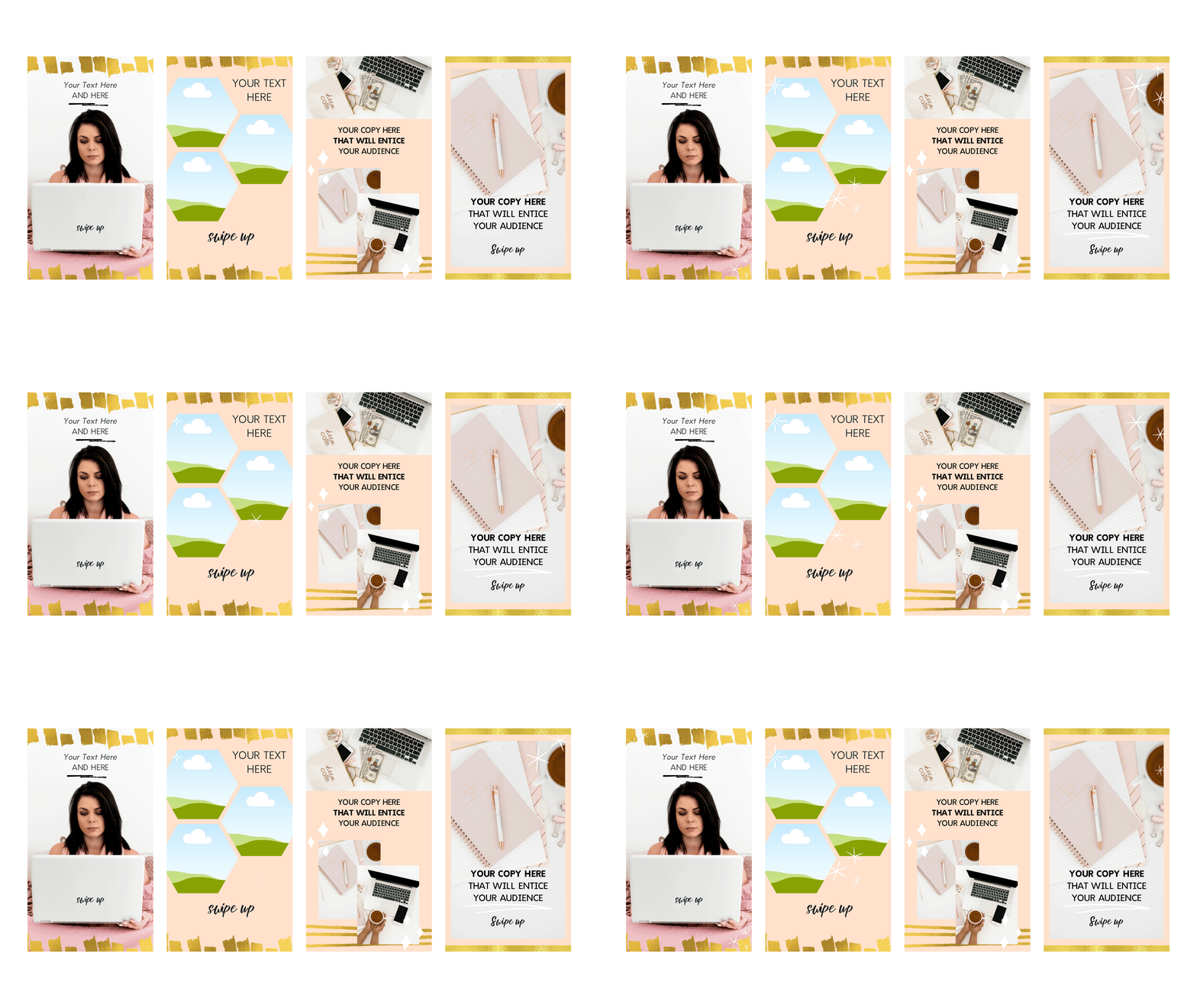
Quick Tips for Designing Facebook Ads in Canva

Use Templates to Streamline Your Design Process
Set up templates in Canva to make the entire process faster. If you want to say even more time check out my template shop.

Try Different Ad styles
Like I mentioned in tip 7 mix it up. There is no one right way and in fact, many people need to see an ad several times before they take action. Use a variety of ad designs in your campaign.

Pay Attention to What Makes You Stop
When ads make you stop scrolling pay attention to what drew you in, was it the colors, the call to action or something else.
This post may contain affiliate links with my honest opinion.
