How to Create a Click-worthy Pinterest Image in Canva
Pinterest has proven to be a key platform for driving traffic and getting sales and it continues to be on the rise.
A whopping 90% of my Traffic comes from Pinterest. Now, of course it is where I place most of my marketing efforts but I chose to do that because it was my leading source of traffic before I went all in on Pinterest being my main marketing platform.
With everyone flocking to Pinterest you might be wondering how to stand out in the Pinterest feed and create eye-catching Pins.
Canva is a popular free design tool that many of people use to create pins. If you are familiar with Canva you might also be wondering how to create eye-catching pins that don’t look like everyone else’s Canva pins.
Canva is stocked with fonts, templates and graphics you can use to create designs for your business. I love Canva but you have to be careful because with it’s rise in popularity came the “Canva Look.”
Don’t worry you can still stand out on Pinterest and use Canva to do it!
Creating Click-worthy Pinterest Image in Canva
Step 1: Determine the Goal of your Pin
Are you trying to get eye’s on a blog post, get opt-ins on a lead magnet, or make the sale? Determining what you want to gain from your Pin will help you in the kind of imagery and text you should use.
Pinterest has put together some great tips that cover these goals. For example, if you want to get eyes on a blog post, Pinterest states, that using the word “new” in a text overlay drove 9x higher aided awareness. If you want to grow your email list or make a sale you would certainly need a Call to Action Text Overlay.
(aided meaning on data collection survey the brand name was mentioned, for example a question could be What Pins do You Recall? And then a multiple choice list of Brand names is provided)
Step 2: Set Your Size
Pinterest states that a 2:3 ratio is best (600 x 900, 1000×1500, 1200×1800 pixels). The smaller the file size the better if you plan to place your pin image on your site. I stick with 600 x 900 px but if you find your pin looking extremely pixelated on Pinterest try one of the larger sizes.

Step 3: Choose Your Background and Creative Elements
This part can be tricky because the creative elements and colors you place on your pin can really make you stand out amongst the crowd and build brand recognition when done consistently. You also have to have to keep in mind what Pinterest likes and will favor, which tends to be bright and light images.
Consider your the industry standard on Pinterest. A pin for a recipe should have a great photo of the meal but a pin for a post on SEO tips should focus more on images and colors that target the ideal audience. In my opinion topics like online business tips have more creative flexibility for graphics (which can be daunting) then topics like cooking or travel which reply more on photography skills.
So what are you to do? Honestly… Test a Few Things out.
Search for your topic and see what comes up. If you see tons images of desk objects and flat-lays then try that but add your own flair by having the cute desk accessories on a bright color background.
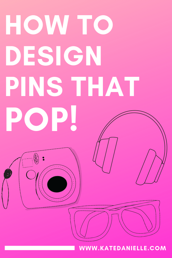
Then you can make a 2nd pin (for the same content) using something completely different then what you see. I like to use gradients, patterns and sometimes solid background colors.
Once you finish your pins you can see which style performs the best or continue to use both styles to help you create multiple pins for the same content.
Step 4: Add your text overlay
Choose a clear font to create the headline on your pin. I cannot stress this enough… Do not get overly creative with your font. You are not designing a wedding invitation; leave the curly script fonts behind.
My goto fonts in Canva are Poppins and Lato, both are available in 3 different weights (light, regular and bold) which makes it easy to emphasize certain words.
Pinterest images are not wedding invitations, leave the curly fonts behind. My goto Canva fonts for #Pinterest graphics are Lato and Poppins, both a clear fonts available in 3 weights.Click To TweetMake your headline large enough that it can be clearly read at the smallest size which would be the Pinterest feed on a phone. Use the Canva zoom feature to view you pin image at a small size. If the headline is hard to read over your background you can add a color block or make your background lighter by adjusting the transparency.

Step 5 Add Your Website or Logo
Always brand your pin with your website or logo. I always put my website near the bottom of my pins in a small font.
In the Pinterest Creative Best Practices it say to place a small logo on your pin. This will be something I test out instead of my website to see if I notice any difference. My guess is there will not be much difference but still a fun test to try!
How to Really Make Pins that Pop with Canva
To add that extra thing to really make your pin stand out in the Pinterest Feed and avoid the “Canva-Look” here is a list of additional tips:
Use gradients in your background (tutorial coming soon)
Use borders to frame in text
Layer Your text
Use a Pop Color: Choose a one of your brightest brand colors (or consider adding one) to use on your pin.
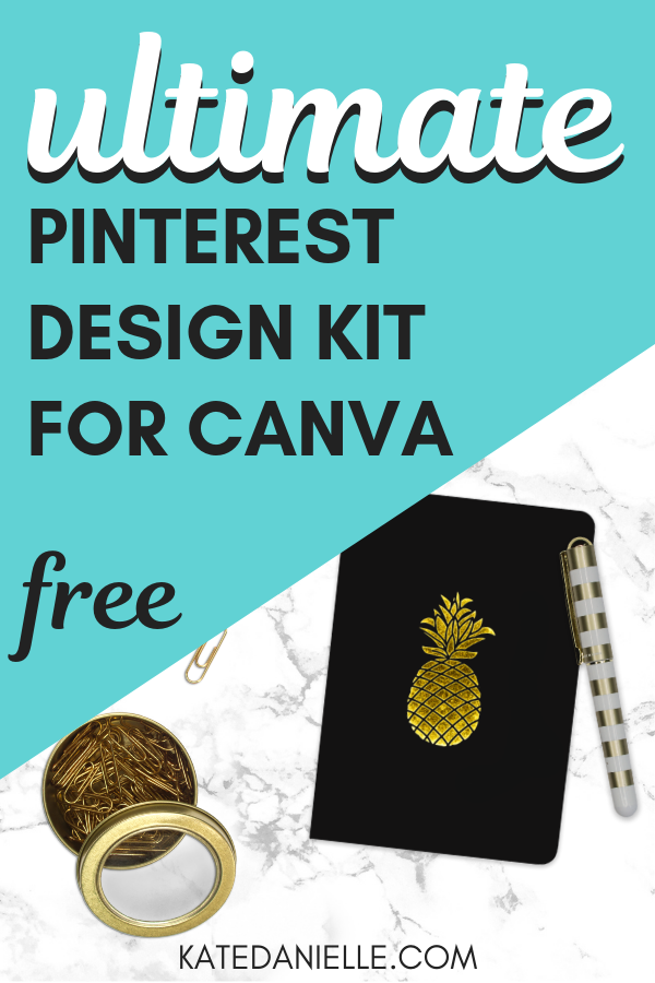
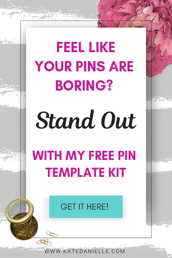
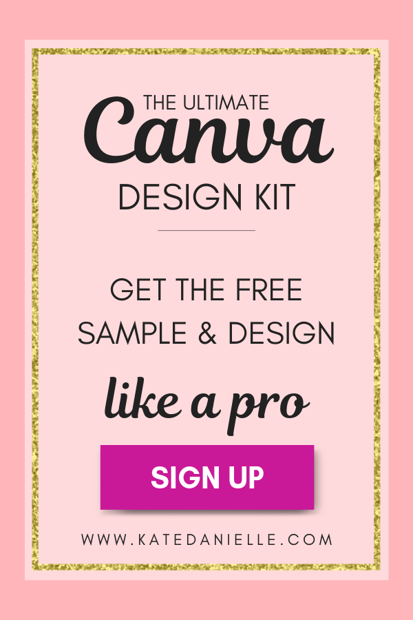
Effortlessly Design Pins that Standout
Now I know as a boss lady you have something awesome to share and seriously the world needs it! That is why I set out to create a template set and design toolkit for Canva that helps boss ladies create unique graphics. You can easily standout in the Pinterest feed as well as other platforms!
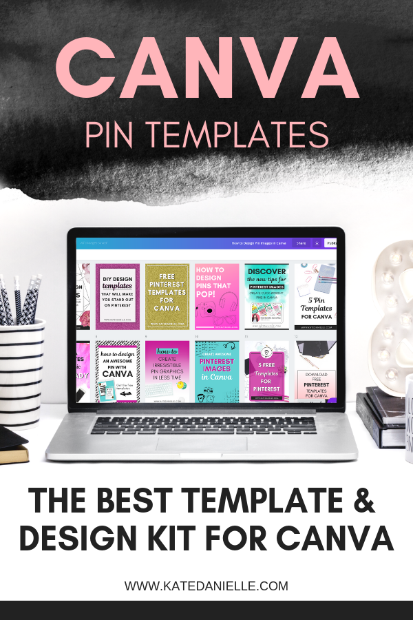
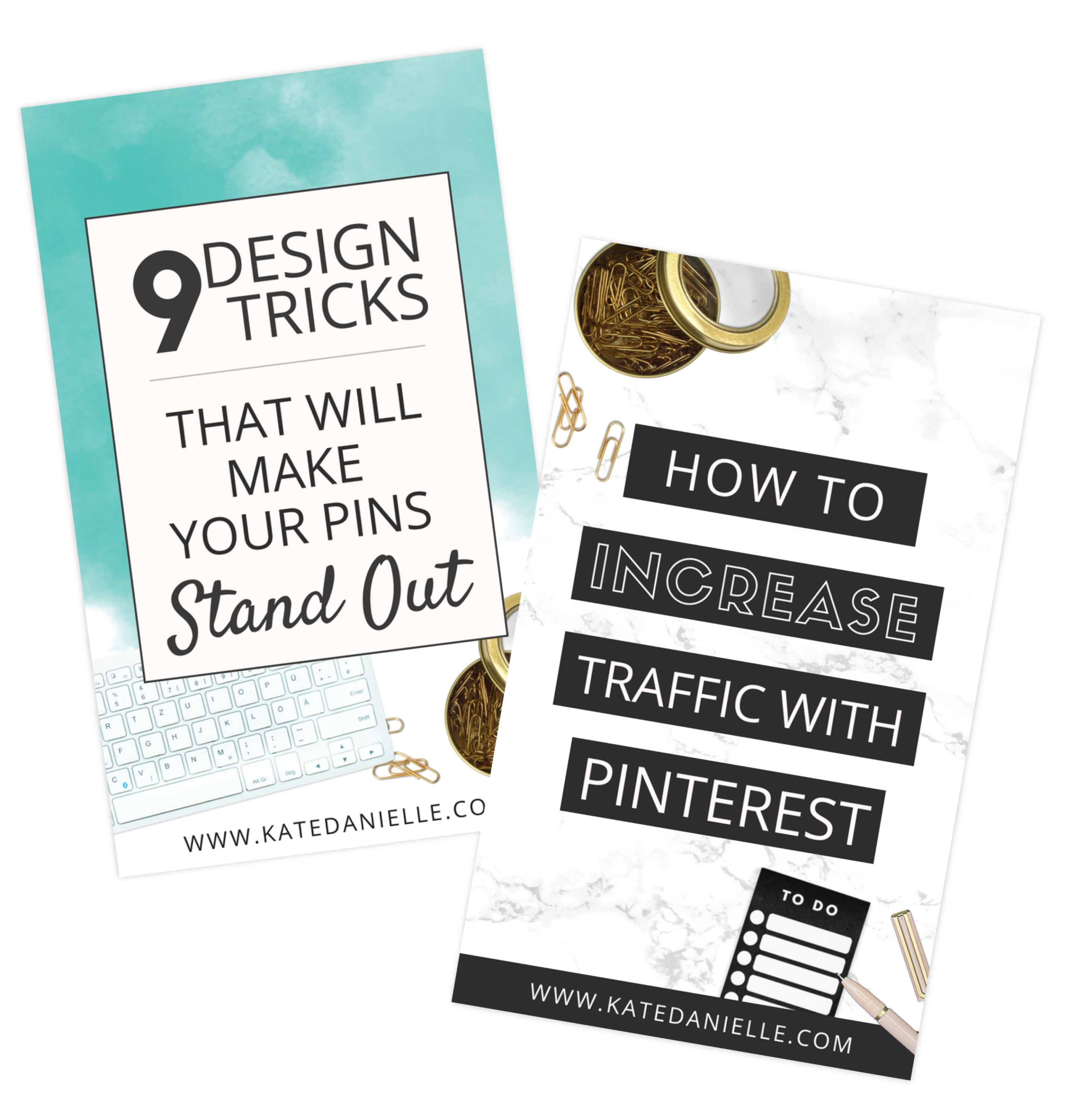
The Boss Lady Design Kit comes with a set of 15 Pinterest Canva templates along with matching Facebook, Instagram and Instagram Story templates.
More importantly the kit also comes with graphics and stock images that will really make your designs pop. You can create real drop shadows, gradients on photos, glitter backgrounds, flat lays and hand drawn graphics.
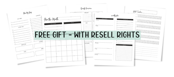
Try the free mini kit now!
Get 5 Pinterest Templates and 6 creative elements!


Howdy Kate! Looks like your link to the Kit is broken (it appears you forgot to add the “https://” 😃)
Just thought I’d let you know–thanks for the awesome content as well!
Thanks so much for letting me know Pete! 🙂 and thank you for reading!
Than you so much good post
Rgds